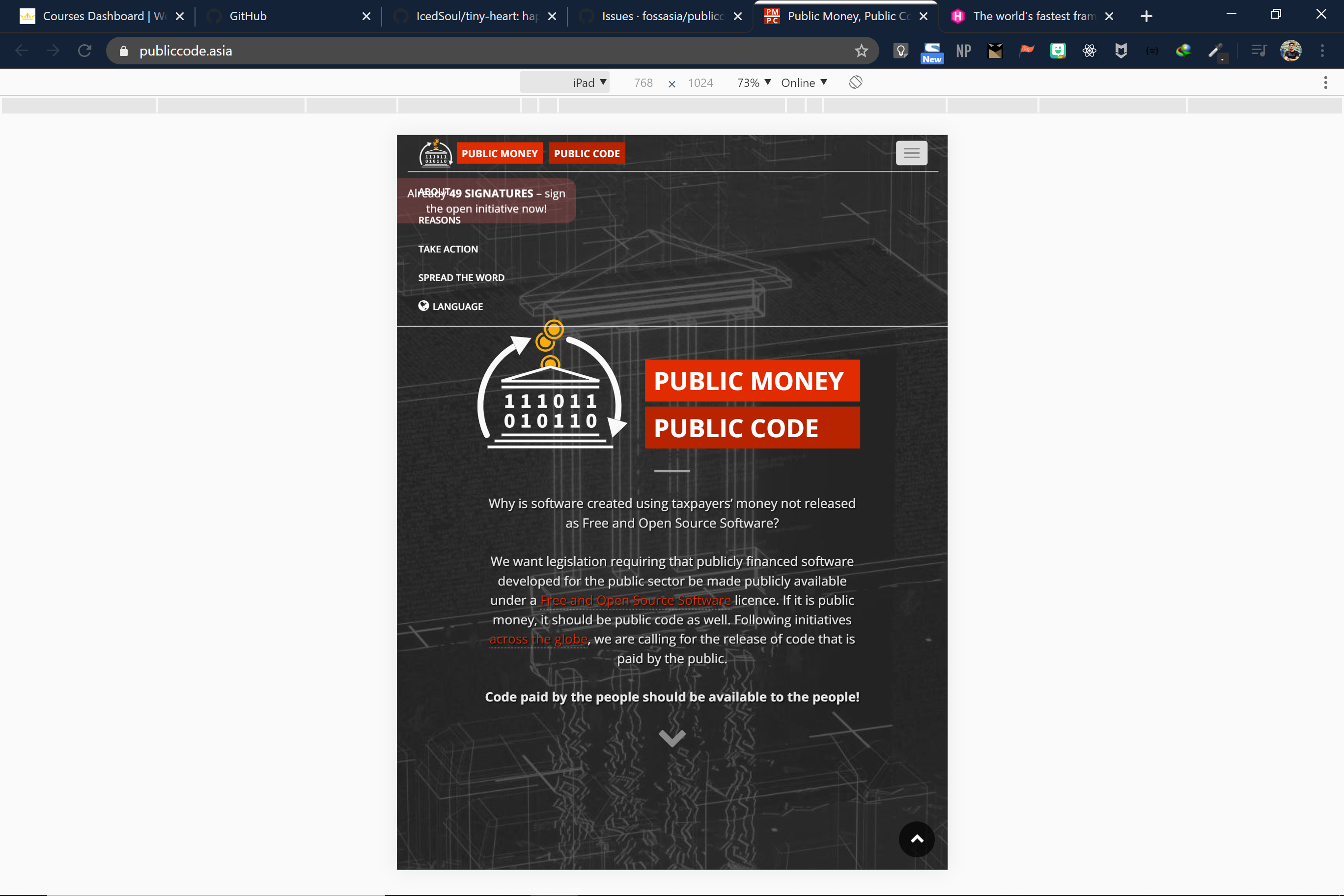
The responsive navigation bar seems to overlap with the 'sign the initiative' box on the top left.
Here's a screenshot of the issue :
Screenshot

Proposed Changes :
Either add a Transparent background to the nav items, when expanded


or we could just change the placement of 'sign in the initiative' box.
I would love to work on this issue, please assign it to me 😃